

Creative Logo Design Trends for Startups in 2025
Brand admin
- November 10, 2025
- 6 Min Read

Startups in places like India – especially Tamil Nadu or Kanyakumari – don’t just pick logos randomly; it’s what people notice first. By 2025, these designs are changing quicker than ever before. Check out the latest shifts shaping up so far, along with tips on using them smartly to craft something unique that holds up over time.
Why Logo Design Trends Matter for Startups
- Your logo shows up everywhere – site, boxes, online posts, flyers, phone programs. So it’s gotta work small or huge, fits any spot.
- Trends hint at how folks want things to look by 2025 – staying ahead keeps your brand feeling fresh.
- Old-looking images might leave people thinking a fresh company feels stuck in the past or out of touch.
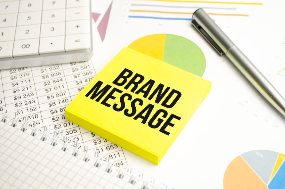
- A well-thought-out look helps people remember your brand, feel confident about it, while standing out where things get busy.
Key Logo Design Trends for 2025
1. Bold Minimalism
Less stuff, bigger effect. In 2025, minimalism sticks around – yet brings sharper differences, heavy lines, or clever empty areas. Picture this
What to do:
- Stick to simple forms but go bold with size – yet keep it balanced overall.
- Stick to just one or two bold colours along with black or white.
- Pay attention to how the icon pairs with the name – or just one by itself.
- Keep it easy to read on phones, apps, tiny displays – works smooth no matter the size.
2. Adaptive & Responsive Logos
Your logo’s gotta fit anywhere – on a phone app, profile pic, or giant roadside sign. By 2025, flexible logos aren’t optional – they’re essential. zemndesign.com+1
What to do:
- Create different versions: one with icon and label, another just the icon, then a tiny favicon for phones.
- Make sure the symbol stays clear even at tiny sizes.
- See what it looks like when set to dark theme, or light – also check printed form alongside screen display.
3. 3D, Depth & Layered Effects
Flat design’s still around, yet hints of depth are sneaking back in. Layered shapes? Yep, they’re trending again. Even 3D-like visuals are showing up more often. Style’s shifting without saying a word. Awesome Sauce Creative+1
What to do:
- Slide in faint shadows or stack shapes just a bit. Use soft overlaps instead of bold lines.
- Avoid bulky realistic touches – stick to simple.
- Apply gradients or extrusions lightly when working online – go easy in screen-based setups.
4. Nature-Inspired & Sustainable Logos
People now focus on what matters, so symbols showing eco-friendly ideas, stuff from nature or shapes found outdoors get picked more often. Invortech together with 1
What to do:
- Try colors from nature – moss green works well, or go for terracotta; muted blues also fit nicely here instead.
- Use designs that come from leaves, while borrowing shapes from waves – maybe add something rough like stone textures too.
- Make sure the layout keeps working at any size while staying flexible.
5. Nostalgia & Retro-Futurism
Old-school vibes from the 70s, 80s, and early 90s mixed with today’s sharp techniques are making waves. Think bold fonts, throwback emblems, or faded color palettes – yet laid out clean and fresh. thenetmencorp.com+1
What to do:
- Play around with faint vintage patterns – or maybe old-style lettering.
- Blend old-school symbols with today’s layout patterns instead.
- Watch out – going overboard on vintage might look old-fashioned, so keep things in check.
6. Custom Typography & Monograms
Pick a fresh typeface, sketch your own letters, or go with a one-of-a-kind emblem – startups are using these to stand out. Think about it like this: Art
What to do:
- Create your own font from scratch or tweak a current one.
- If your startup’s name runs too long, go with initials instead – otherwise a monogram might work better.
- Keep it readable no matter the size – whether tiny icons, social media pics, or printed pages.
7. Hand-Drawn & Imperfect Marks
Realness feels fresh right now. Instead of slick corporate symbols, logos that look hand-drawn, slightly messy or include little drawings catch eyes more easily. Zeka Design
What to do:
- Use light pencil-like strokes or rough-drawn details here and there.
- Try it for labels that feel handmade, rooted in place, shaped by people, made with care – think small batches, real stories, hands-on touch.
- Pair it with clean gaps to keep things from appearing cluttered.
8. Motion & Animated Logos
A lot of new online businesses need more than just a basic logo. Moving versions work better now – think quick intros, phone app openings, or clips on social media. Check it out at zemndesign.com
What to do:
- Set up an easy motion – like showing a logo, changing hues, or shifting an icon’s position.
- Falls back smoothly to a static layout when printed.
- Try it on phones plus online – make sure it runs easy, no heavy stuff.
How to Choose the Right Trend for Your Startup
- Familiarize yourself with who you’re speaking to – does a high-tech vibe hit home, or do they lean toward handcrafted charm? Maybe flashy elegance wins them over, or perhaps neighborhood roots matter most.
- What does your brand stand for – green choices… or fresh bold moves… maybe timeless reliability?
- Think about how you’ll use it: starting online? Need a mobile shortcut? mostly printing stuff?
- Look ahead: Styles change, so pick what lasts instead of fading fast.
- Stay flexible: the logo should still look good in grayscale, when tiny, or scaled up smoothly – so test it everywhere.
- Team up with someone skilled – like a branding expert who gets startups – so you nail the look without losing practicality.
Mistakes Startups Should Avoid
- Chasing a fad without thinking about your brand? It just feels copycat.
- Logos too detailed to stay clear at small sizes.
- Pinning everything on what’s hot right now instead of building something that lasts.
- Skipping differences between mobile and print – logo works fine on desktop yet crashes as a small app icon.
- Skipping required legal steps – like trademark or originality verification.
Conclusion
In 2025, fresh chances pop up for startup logos. Go bold with clean looks, eco-minded visuals, throwback sci-fi vibes, or motion elements – your choice shapes how people see your brand. Match the symbol to your message so customers feel it right away.
A fresh venture in India might stand out simply by nailing its look early – picking a style that fits just right – not only catching eyes but also building something people recall easily.