The Psychology Behind Logo Colors and Shapes in Branding

In branding, your logo isn’t simply a nice image – it acts like a silent message shaping first impressions before anyone engages with you. Each shade, line, or angle sends subtle signals. Knowing how colors and forms affect emotions lets you craft something that doesn’t just appear sharp but resonates strongly with the right crowd.
Why Psychology Matters in Logo Design
Studies into how we see colors reveal snap judgments happen fast – like, under ten seconds – and nearly 9 out of 10 times, it’s the shade doing the talking. On top of that, forms send signals too; rounded lines come off friendly, whereas straight ones hint at power and accuracy.
When new companies or small businesses shape their brand, matching visual design with what the brand stands for builds a logo people recall and believe in – because visuals speak before words do.
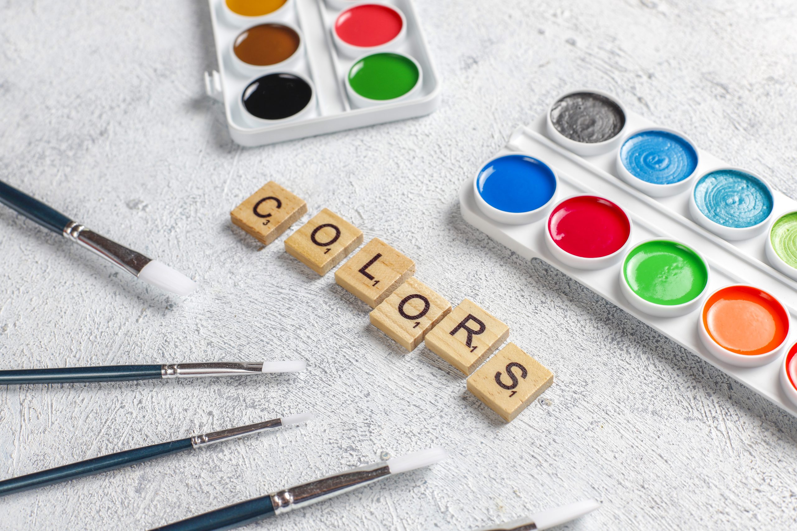
The Psychology of Logo Colors
1. Red – Passion, Energy & Urgency
Red pulls focus fast while stirring up feelings. Perfect for companies aiming to feel energetic, strong, or lively – just like Coke or YouTube show off. Still, handle with care since too much might tire the eyes out.
Great for: food spots, workout lovers, fun seekers, shops aiming to spark energy or real interest.
2. Blue – Trust, Stability & Professionalism
Blue helps people feel steady and sure. This shade pops up everywhere in branding since it gives off trust vibes. Tech firms use it, so do banks – health companies too. You spot it often because it just feels dependable.
Great fit for new tech firms, schools, businesses, or banks – works well if you’re launching in these areas.
3. Green – Growth, Health & Sustainability
Green links to plants, harmony, and also fresh starts. Works well for green-focused farms, natural wellness brands, or outdoor lifestyle businesses.
Great if you’re into natural products, green living or eco-friendly projects.
4. Yellow – Optimism, Creativity & Warmth
Yellow brings up feelings of joy along with warmth. It feels lively yet might feel too much when used heavily.
Great for: creative studios – also food labels…or young companies targeting children.
5. Black – Luxury, Power & Sophistication
Dark emblems look strong, never go out of style. Combine them with light shades or metallics – they bring classy flair.
Perfect if you’re into high-end style, runway looks, bold visuals, or top-tier gadgets.
6. Orange – Enthusiasm & Confidence
Orange mixes red’s power with yellow’s warmth, creating a lively vibe. Brands aimed at bold, fun crowds tend to pick it when they want to feel inventive yet budget-friendly.
Great if you’re into media or travel – or launching a tech-focused new venture.
7. Purple – Creativity, Royalty & Wisdom
Purple mixes blue’s calmness with red’s fire – so it stands for creativity plus smart thinking.
Great for education, also lifestyle – creative fields too.
8. White & Neutral Tones – Simplicity & Clarity
Simple logos with white, grey, or beige tones feel clean – showing honesty while looking sharp. These colors give off a no-nonsense vibe, staying clear without clutter; they suggest trust through quiet confidence instead of loud statements.
Great if you’re a new startup, clinic, or business-focused brand needing clear messaging. Though it suits teams wanting straightforward styles.
The Psychology of Logo Shapes
1. Circles – Unity & Community
Circles give off a warm, balanced vibe, pulling people in. Because they loop without end, these shapes suggest lasting connection, which works well for teams or community-focused names.
Examples: Pepsi – like Spotify or even BMW.
2. Squares & Rectangles – Strength & Reliability
Clean lines suggest control, structure – reliability. Such forms imply stability, a no-nonsense approach.
Examples: Microsoft – BBC – also LinkedIn.
3. Triangles – Innovation & Leadership
Circles seem restless, aiming forward – like motion or strength. Their sense changes with position: upward tip brings balance, downward tilt hints at danger.
Examples: Delta, Reebok.
4. Abstract or Custom Shapes – Creativity & Originality
Today’s companies usually pick symbolic logos to be different while giving room for creative stories instead.
Example: Nike’s check mark, also Airbnb’s symbol called Bélo.
5. Organic & Fluid Shapes – Flexibility & Approachability
Curvy shapes with smooth edges hint at imagination, warmth, or going-with-the-flow attitudes. That kind of look shows up more these days in fresh brands built around how people live now.
Combining Colors and Shapes Strategically
The real power behind logo meaning lies in the way hues mix with forms.
For instance:
- A blue circle stands for reliability, also a sense of togetherness.
- A red triangle hints at power, also sparks fresh ideas.
- A green leaf outline right away hints at expansion – also care for nature.
- Using them together, companies show their purpose through images – no words needed.
Tips for Startups Building a Logo
- Figure out who you are as a brand before anything else – that way, your logo can match it.
- Look into what makes your audience feel strong emotions.
- Keep colors matching whether it’s on paper, screens, or products.
- Try your logo in grayscale so it stays flexible.
- Stick to basics but make it count – less clutter means it lasts longer.
Final Thoughts
The mind’s role in creating logos isn’t only about looks but also how messages are shared.
Colors mixed with shapes create a quiet way of talking straight to how people feel. Startups or new brands might use this mind trick well – turning their logo into a powerful ad weapon.
A good-looking logo isn’t only about showing who you are – it gains confidence, sparks feelings, or drives long-term connection.