

How Road Slope Analysis & a 24×15 Ft Hoarding Changed a Restaurant’s Footfall Forever

Brand admin
- May 23, 2026
- 8 Min Read
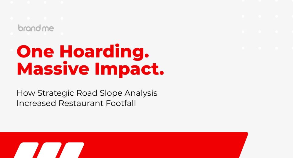
Traditional advertising isn’t dead. It’s just been done lazily. This is the story of how Brandme used road geometry, competitor mapping, and data-backed creative design to transform a single hoarding at Marthandam into a footfall machine for Paanchali Sea Food Restaurant.
When most agencies talk about “outdoor advertising,” they mean: pick a wall, print a banner, hope for the best. When Brandme Creative Agency was approached by Paanchali Sea Food Restaurant in Marthandam, Tamil Nadu, we took a fundamentally different approach — one grounded in field analytics, consumer movement patterns, and strategic design thinking.
This case study breaks down exactly what we observed, what we decided, and why the results weren’t a surprise to us — even though they were to the client.
The Client & The Brief
Paanchali Sea Food Restaurant is a beloved dining destination in Marthandam, known for its authentic Kanyakumari-style seafood — particularly its famous Chatti Choru (clay pot rice meals). With a strong 4.6-star Google rating and a loyal local fanbase, Paanchali was well-regarded but felt it was missing a segment of the passing traffic on the busy SH-90 corridor.
The brief was straightforward: increase visibility, attract new diners, and compete more directly with a rival restaurant located just across the road on the left side of the highway. The client had wall space available on the restaurant’s exterior — an existing, faded flex panel that was doing nothing for the brand.
Our task: design and deploy a hoarding (24 ft wide × 15 ft tall) that would maximise visibility and conversions among passing traffic.
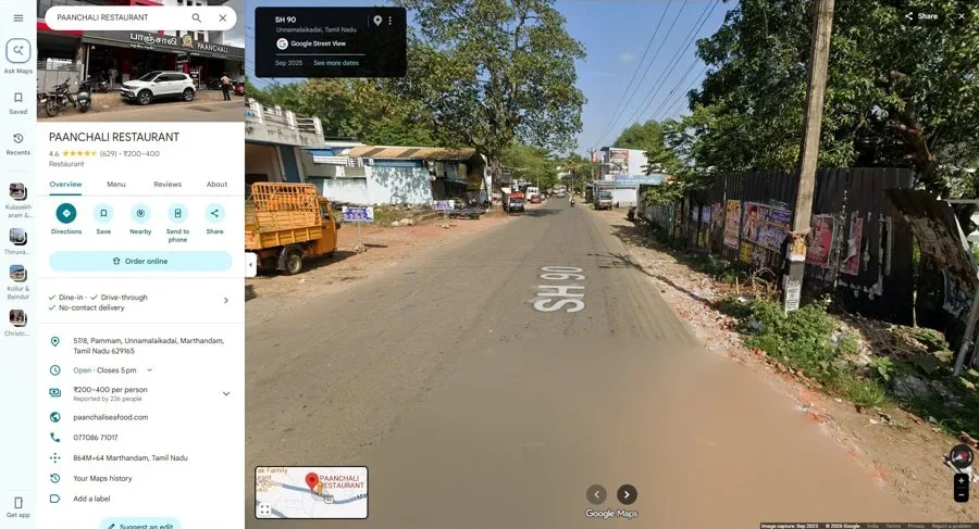
Step 1: Field Analytics — We Read the Road Before We Designed
Before a single pixel was placed, the Brandme team visited the site and studied the physical environment. This isn’t a step most advertising agencies in Chennai — or anywhere in India — include in their outdoor advertising workflow. We believe it’s non-negotiable.
Here's what our field observation revealed:
01. Road Ascent Analysis on SH-90
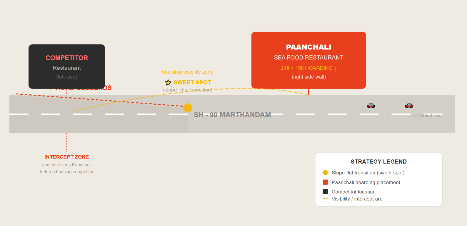
We identified the transitional zone — the point between where the road descends and where it levels out — as the maximum attention window. At this juncture, drivers have slowed, visibility is high, and decision-making happens (turn left? stop here? pull in?). Paanchali's wall sits almost exactly at this transition point. This is where the hoarding needed to work hardest.
02. The "Sweet Spot" Between Slope and Flat
We identified the transitional zone — the point between where the road descends and where it levels out — as the maximum attention window. At this juncture, drivers have slowed, visibility is high, and decision-making happens (turn left? stop here? pull in?). Paanchali's wall sits almost exactly at this transition point. This is where the hoarding needed to work hardest.
03. Competitor Restaurant — Left Side Threat
At the bottom of the slope, on the left side of the road, sits a competing restaurant. Traffic descending from above would naturally encounter the competitor first — before even reaching Paanchali. This meant our hoarding had to work as both a brand visibility tool AND a competitor interception device — capturing the attention of diners who might otherwise default to the first option they see.
04. Wall Size & Viewing Angle Calculation
The available wall space was assessed for optimal hoarding dimensions. A 24 ft wide × 15 ft tall format was determined to be the sweet spot — large enough to dominate the visual field of passing traffic, but proportioned correctly for the wall's height and viewing distance. The hoarding would be visible from both directions of SH-90, extending its reach beyond just one traffic flow.
🔍 The Brandme Insight
Most hoardings fail not because of bad design — but because of bad placement thinking. Agencies skip the field study and go straight to Photoshop. We do the opposite. The physical environment is the first creative brief.
In this case, the road slope wasn’t just a geography fact — it was our strategic asset. A descending road = slower vehicles + elevated eye line + longer dwell time on the hoarding. That’s free media amplification that no budget can buy.
Step 2: Design Strategy — Every Creative Decision Was Data-Backed
With the field intelligence gathered, we moved into creative design. The brief to our design team wasn’t “make it look nice.” It was precise:
Brand Name: Maximum Size, First Read
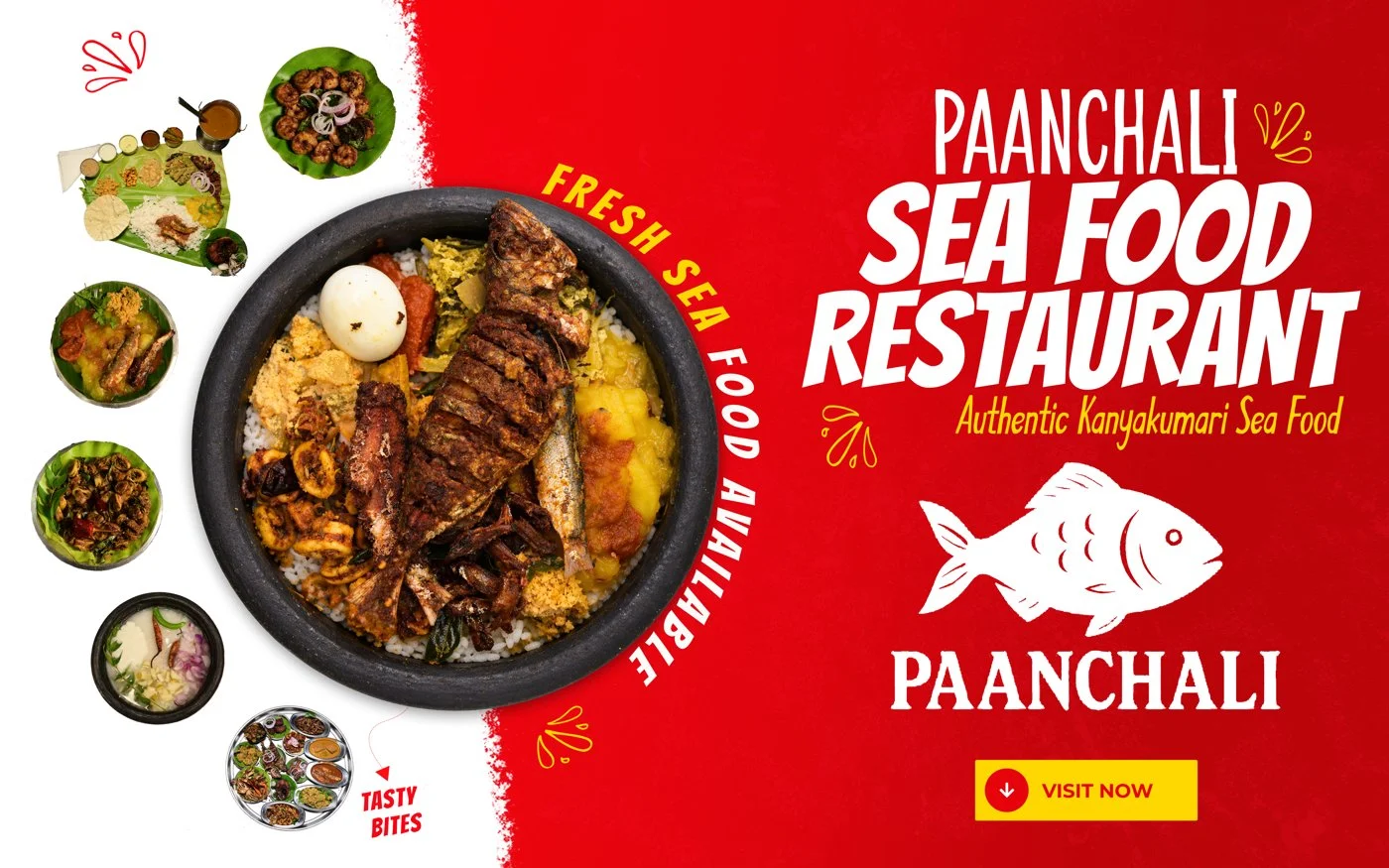
PAANCHALI needed to read from 100+ metres away. We set the brand name at the largest possible size in the hierarchy — ensuring it registers in the peripheral vision of vehicles approaching from either direction.
Category Clarity: "Sea Food Restaurant"
In a high-competition food corridor, category declaration is everything. We made "SEA FOOD RESTAURANT" the second-largest typographic element — so viewers know immediately what Paanchali offers before they're even close enough to read anything else.
Hero Product: Chatti Choru Highlighted
Chatti Choru is Paanchali's signature dish and a strong differentiator. By highlighting it prominently — visually and typographically — the hoarding speaks directly to local food culture and creates an instant craving trigger.
Red + White: High Contrast for Road Visibility
Red commands attention on roads — it's psychologically associated with food, urgency, and appetite. White text on red creates the maximum legibility contrast at distance. No fancy gradients. No clutter. Just unmissable visual impact.
Real Food Photography — Not Illustrations
Authentic, high-resolution food photography was used to showcase actual dishes. Real food triggers hunger responses far more effectively than stylised illustrations. The centrepiece seafood rice bowl creates an immediate "I want that" reaction.
Fish Icon — Instant Category Symbol
A bold, clean fish illustration anchors the seafood identity visually. Even at speed, the fish silhouette communicates "seafood restaurant" before a single word is read. It's visual shorthand that works at 60 kmph.
The Road Map — Visualising the Strategy
Here’s a simplified representation of the spatial strategy we used to determine hoarding placement and design priorities:
Why This Approach Defines the Best Ad Agencies in India
The Paanchali project is a perfect illustration of what separates genuinely strategic advertising agencies from production houses that simply output designs. Traditional advertising — hoardings, flex boards, banners — is often dismissed as “old school” in an era obsessed with digital ROI. But the truth is that traditional advertising still commands massive reach, especially in Tier-2 and Tier-3 markets across India.
The difference between a hoarding that works and one that doesn’t is almost never the artwork quality alone. It’s the pre-design intelligence: understanding who sees it, from where, at what speed, and in what decision-making context.
24×15
Ft Hoarding — Optimised Dimensions
SH-90
High-Traffic State Highway, Marthandam
3 in 1
Brand Visibility + Category + Hero Product
What We Learned — And What Every Business Should Know
This project reinforced several principles that guide how Brandme approaches every outdoor advertising engagement — whether for a restaurant in Marthandam or a retail brand in Chennai:
1. Geography Is Strategy
Road topology, traffic patterns, sun angles, competitor proximity — these are all marketing variables. Ignoring them is leaving ROI on the table. Any top advertising company in India should be doing this fieldwork before creative begins.
2. Traditional Advertising Has Measurable ROI
Outdoor media delivers what digital can’t: unavoidable, unskippable reach in physical space. A well-placed hoarding runs 24/7, needs no Wi-Fi, and can’t be ad-blocked. When placed strategically, it functions as a permanent brand beacon for thousands of daily commuters.
3. Design Hierarchy Is Decision Architecture
The order in which elements are read — brand name first, category second, hero product third — is not an aesthetic choice. It’s a decision funnel. Get the hierarchy wrong and you lose the viewer before they’ve processed the most important message.
4. Competitor Proximity Is an Opportunity
Many businesses see a nearby competitor as a threat to avoid. Brandme sees it as a targeting parameter. When your hoarding intercepts customers who are en route to your competitor, you’re not just advertising — you’re redirecting purchase intent.
Key Takeaway
The Paanchali hoarding project is proof that the best advertising isn’t always the most expensive or the most digital. Sometimes it’s a 24×15 ft piece of flex — designed with intelligence, placed with purpose, and built to intercept the right audience at the right moment. That’s what Brandme brings to every brief, big or small.
Want This for Your Business?
Whether you’re a restaurant, a retail brand, a real estate developer, or any business looking to leverage outdoor advertising that actually works — Brandme brings the same analytical rigour and creative excellence to every project.
We are one of India’s most strategic advertising agencies — based in Chennai, working across Tamil Nadu, pan-India, and globally. We don’t just design hoardings. We engineer visibility.